- Healthcare
- Web app
- Design system
Patient Management System · case study
A clinic's worklist that says what needs doing now.
A staff system for a busy diagnostic clinic. Our team designed the first version in 2020; in 2026 I audited it and redesigned it: one clear priority and status language, task lists that show what needs action now, and role-aware views. Built as a working prototype on a documented design system.
- Role
- Product Designer
- Timeline
- 2020 · revisited 2026
- Company
- New Malden Diagnostic Centre
- Location
- London, UK
- Team
- 2 designers, 1 PM, 1 front-end and 1 back-end developer
Deliverables
- UX audit
- Flows
- Prototype
- Design system
- The problem
- In our 2020 version, staff at a busy diagnostic clinic could not tell what needed action now. Priority was invisible, status was colour-only, and two core flows did not exist.
- What I did
- Audited our own first version, defined the pathway, task states and roles, redesigned the key flows, and built a working prototype on a documented design system.
- The result
- A clickable product covering referral to billing for three roles, in light and dark, with every component documented in Storybook.
- roles, each with its own view
- 3
- task states with allowed moves
- 6
- documented Storybook stories
- 60+
- text contrast in both themes
- AA
Project Overview
We shipped it in 2020. Six years later, I could see where it failed.
New Malden Diagnostic Centre is a private outpatient and diagnostics clinic in South London: imaging, specialist clinics and a paediatric department, six days a week.
Its staff system registers patients, books clinics, tracks results and reports activity for billing, linked to Myorb for radiology, an on-site lab and Healthcode for insurers.
In 2026 I audited our own first version and redesigned the parts that matter most.
Goals
Product goals, from the brief
- 01Register patients and find existing records, adding a new episode of care rather than a duplicate
- 02Schedule appointments into clinics
- 03Check patients in on arrival so clinicians can see who is here
- 04Manage tasks in worklists, each with a priority and a full log of who did what and when
- 05Report activity by time frame and funding source, for billing
Design goals
- 01Staff see in seconds what needs action now, without scanning a table
- 02Priority and status can never be misread, including by colour-blind users
- 03Each role sees exactly what they may act on
- 04Mistakes are prevented, not fixed afterwards
Who it is for
Nobody here gets to use the system in peace.
Phones ring, patients walk in, a consultant waits. Personas come only from the roles in the brief, with no invented characters.
Admin / Reception
Keeps the day moving
Register patients, keep clinics booked, check patients in, keep worklists clear.
Front desk and back office, high interruption. Some also hold the Finance capability.
Consultant
Sees only their patients
Run clinic efficiently, request a test in one step mid-consultation, get results back with little admin.
Consulting or scanning room, patient present, time-boxed.
Consultant Secretary
Acts for one consultant
Book and manage their consultant's patients quickly, keep the list clean.
Office, working for a named consultant. Cannot see unrelated tasks.
My Role
- 01Turned the brief into a domain model and the lifecycle of a booking task
- 02Audited the existing screens against usability heuristics and WCAG
- 03Defined information architecture and flows for each role
- 04Designed the visual language and every screen, in light and dark
- 05Built the design system: tokens, components, documentation in Storybook
- 06Built the clickable prototype in code, so the flows can be tried, not just viewed
Research
Before redrawing anything, I audited what we had shipped.
Sources: the client's proposal, the pathway diagram, paper referral forms and our 2020 screens, eleven for admins and six for doctors.
Five screens reviewed against Nielsen's heuristics and WCAG 2.1 AA, each finding rated by severity.
- 01Priority was invisible
The brief makes routine, urgent and red flag core, yet the booking list had no priority column. Staff could not triage.
- 02No patient name in results
The admin results list had twelve columns, but none said whose result you were chasing.
- 03Check-in was hidden
Marking a patient as arrived is a core daily task for reception, yet it lived only in a row menu in the doctor's view.
- 04No online referral form
Daily intake still depended on paper.
Also found
- •Status shown by colour alone; two states read as near-identical green
- •No “what needs me now” view: flat lists, no default sort or grouping
- •Role-blind: the same interface for every role
- •Placeholder content everywhere, hiding real edge cases
Define
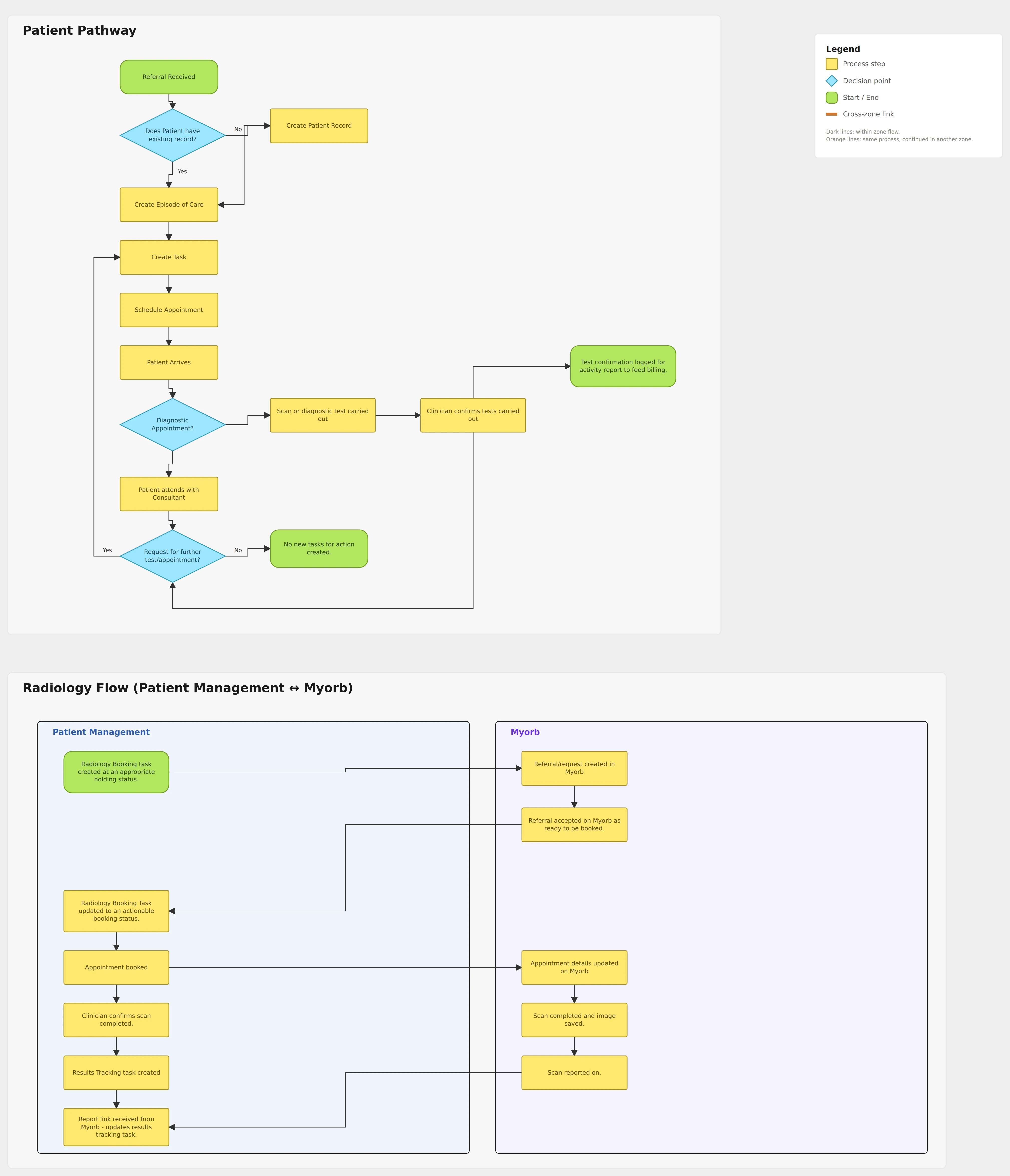
I turned the clinic's pathway into a flow the product could follow.
It splits after check-in: a test is confirmed by the clinician and logged for billing, a consultation goes straight to one question, whether another test is needed. Yes loops back to a new task in the same episode. The steps in blue are what the audit added: a duplicate check and check-in.
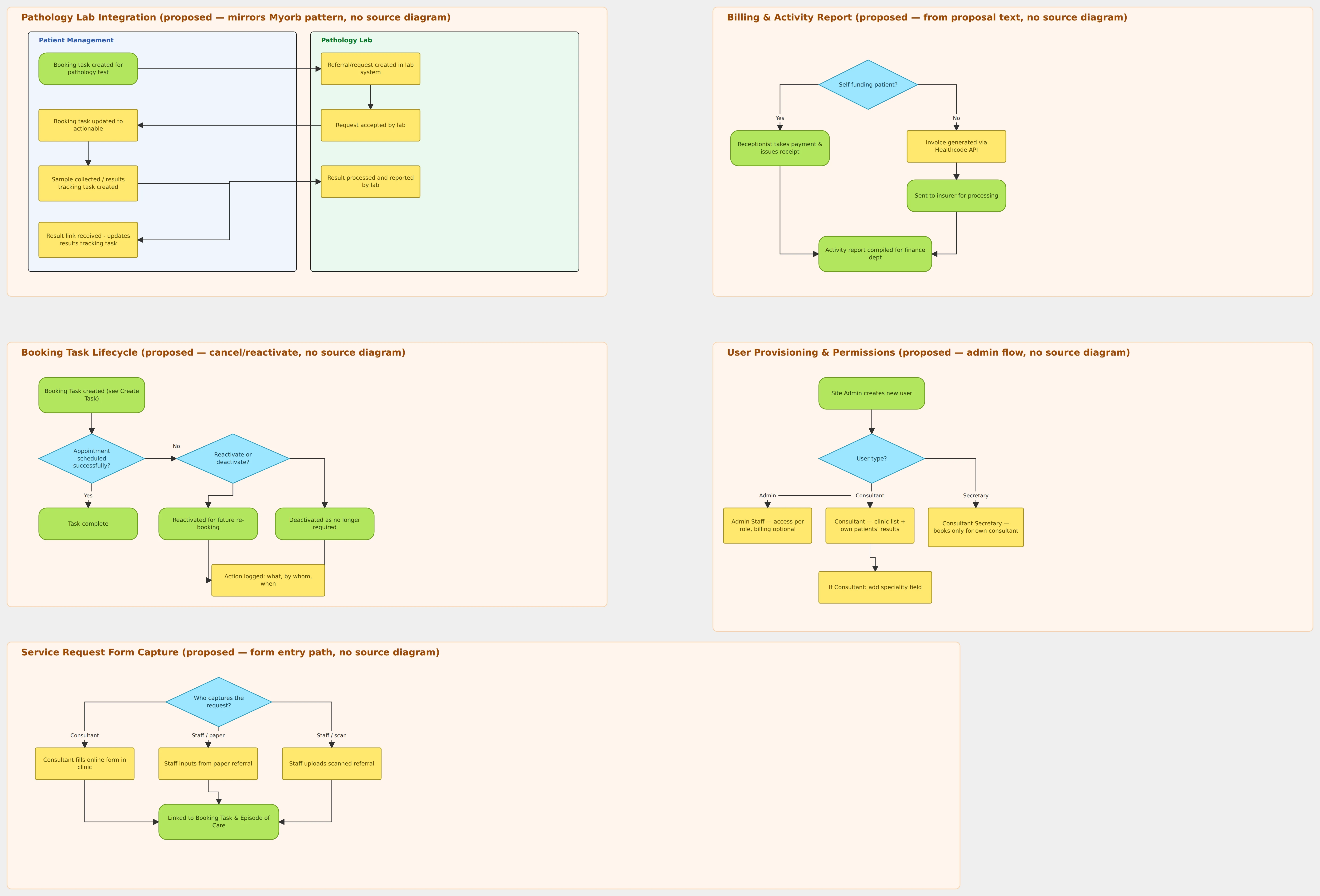
A status model settled most arguments before they started.
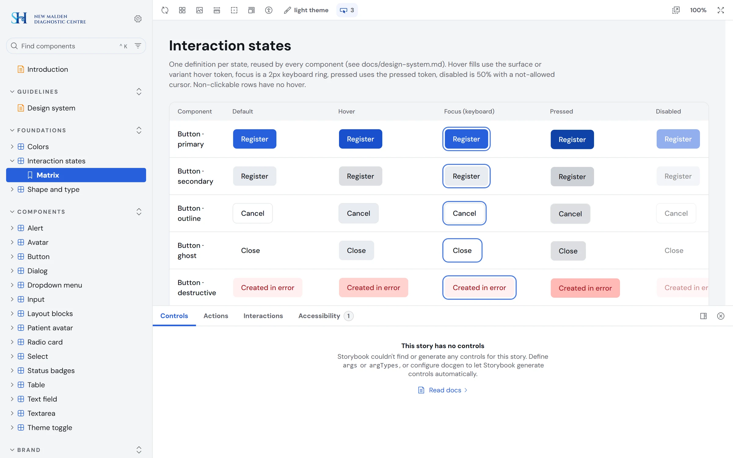
Every state and allowed move is written down, so a button never offers something the process does not allow.
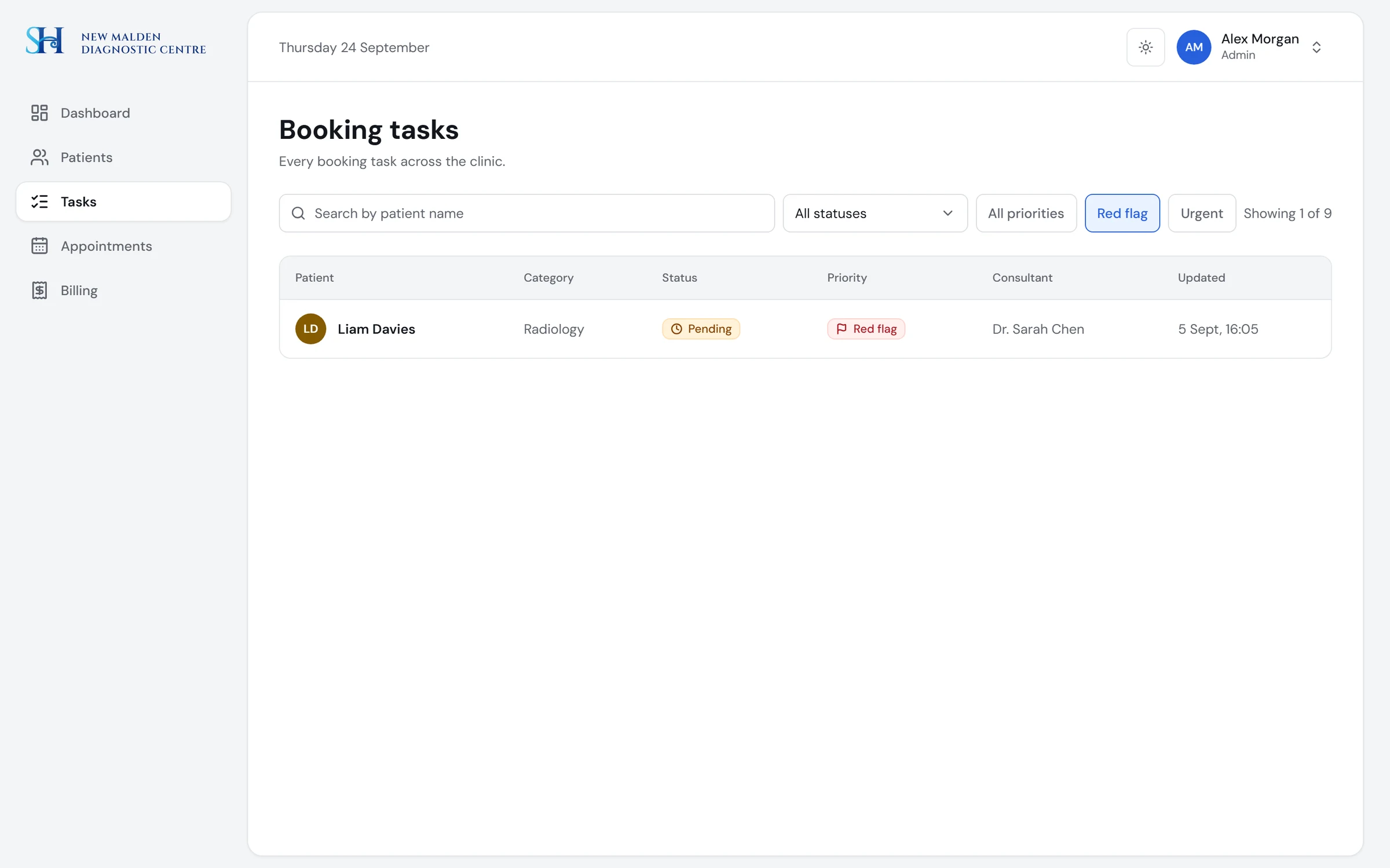
- •Priority (routine, urgent, red flag) is separate from status and shows as a column, a sort and a filter on every list
- •Deactivating a task always needs a reason; “no longer required” needs it in writing
- •Every status and priority is icon, label and colour, never colour alone
- •Statuses group by meaning: needs action, waiting, done, closed. This fixed the two look-alike greens from the audit
Each role sees only what it can act on.
One navigation, filtered by role: a secretary sees their consultant's list, a consultant sees their own patients.
| Area | Admin / Reception | Consultant | Secretary |
|---|---|---|---|
| Dashboard | Triage across all lists | My patients, arrivals, results awaited | My consultant's list and clinics |
| Booking tasks | All | Request from clinic | Scoped to their consultant |
| Results | All | My patients only | Scoped |
| Billing and reports | Finance capability only | No | No |
Design
Direction
Calm, precise, unflashy
The brief was a well-run reception desk, not a cold hospital portal and not a consumer health app. Colour is reserved for meaning, so status is the only thing that shouts. A rule I kept: red is reserved for system errors, so a clinical red flag can never be mistaken for a validation error.
- •A first direction with a deep-blue sidebar was rejected in review as too heavy
- •The final look: a light canvas, a white work panel, bordered tables, initials avatars and soft tinted status pills with icons
- •DM Sans, one type scale from 12 to 28 px, one blue for action
Prototype
A product you can use
I built the redesign as a clickable prototype with seeded data and a role switcher instead of a login. This was a deliberate cut: a reviewer judges screens and flows, so the effort went into the interface, not a database. State changes are real within a session: creating an episode adds a task, scheduling moves it to Scheduled, logging billing marks the episode paid or invoiced.
Design system
From screens to a system
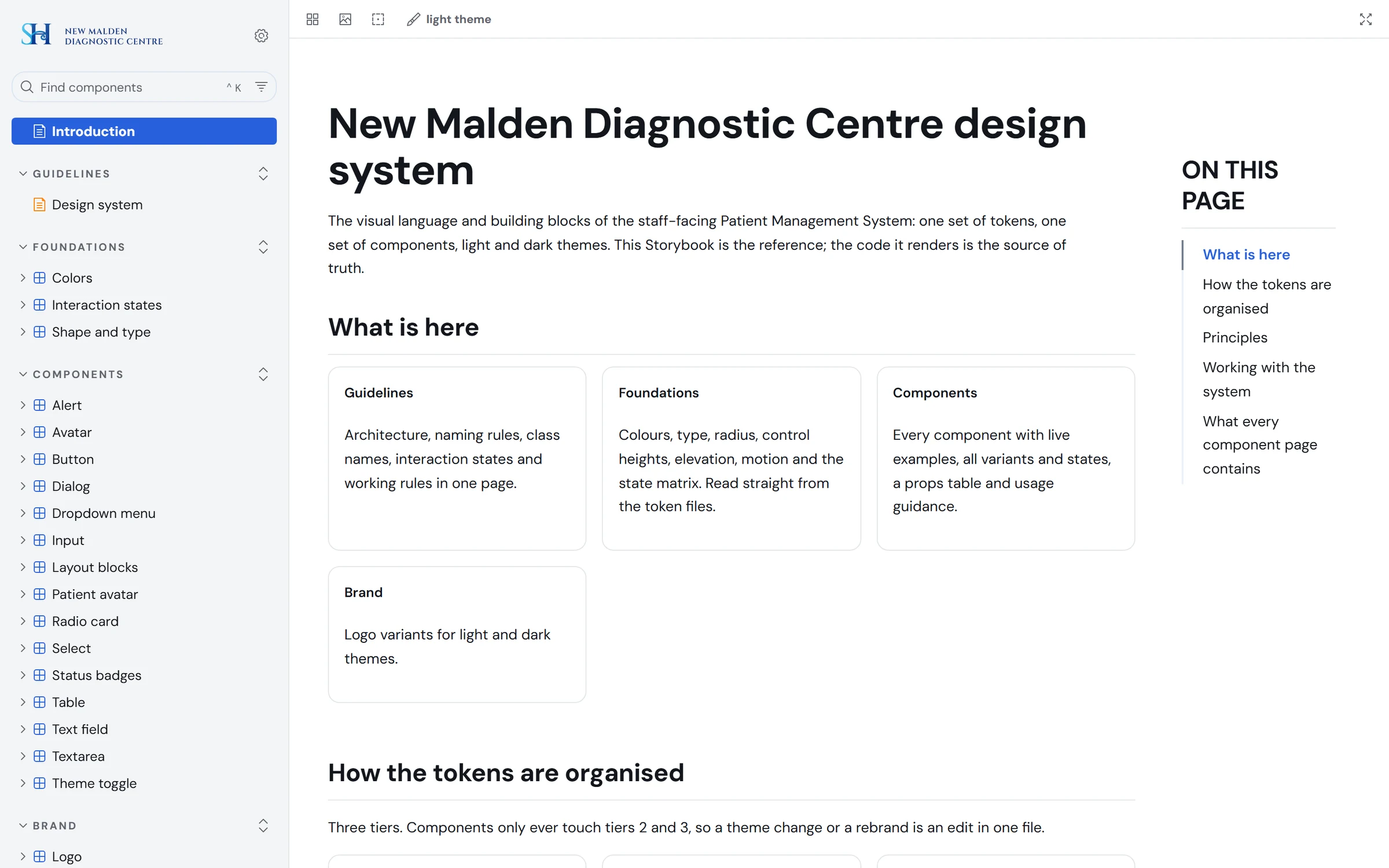
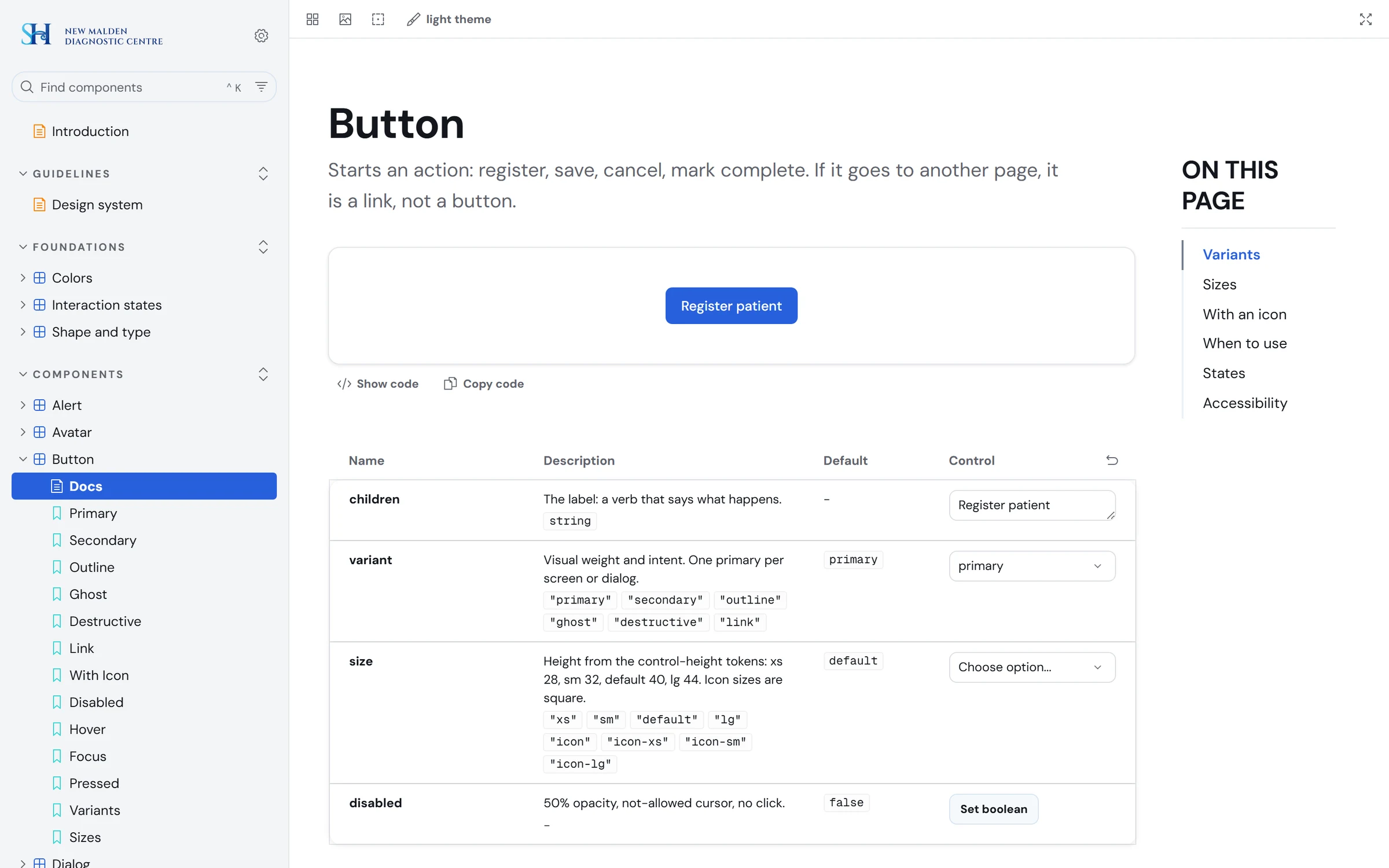
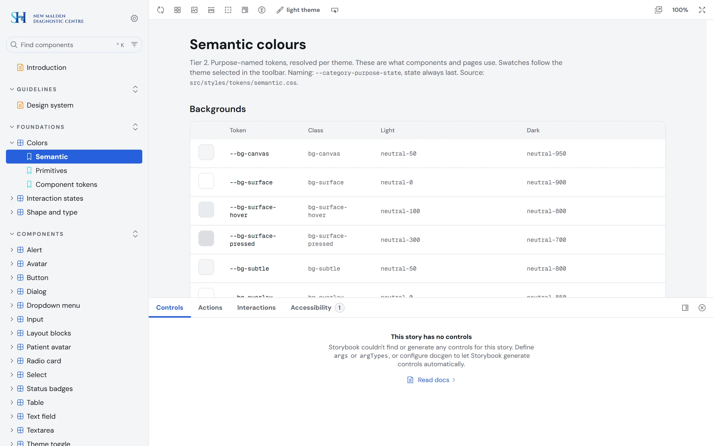
Once the screens existed I turned them into a system, so the next screen would be faster and consistent. Three token tiers, light and dark themes from the same tokens, and every component documented with variants, states, do and don't, and accessibility notes.
Audit findings and the redesign
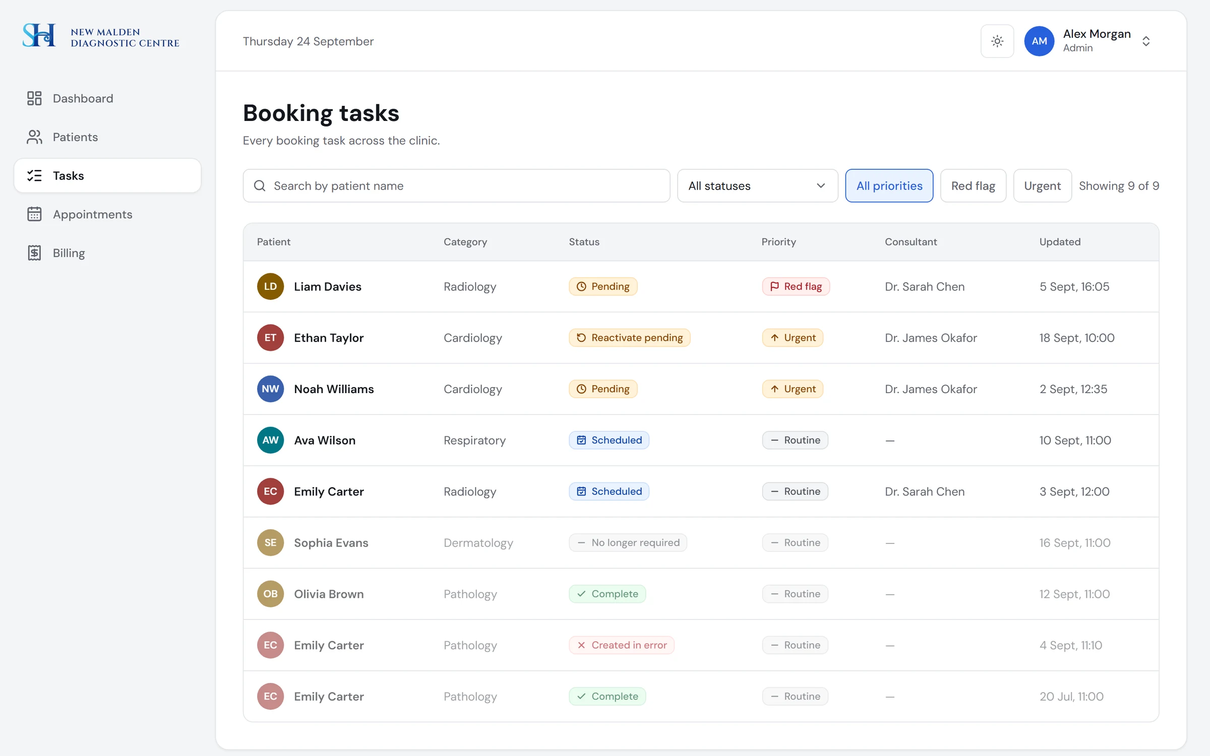
What our first version got wrong, and what replaced it.
Finding 01
Priority invisible, status by colour alone, no “what needs me now”
A priority tag and an icon-and-label status on every task, filters by priority, and a dashboard that lists what needs attention first.
Version 1 · 2020
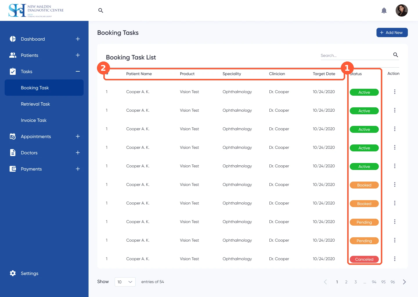
Redesign · 2026
Redesign · 2026
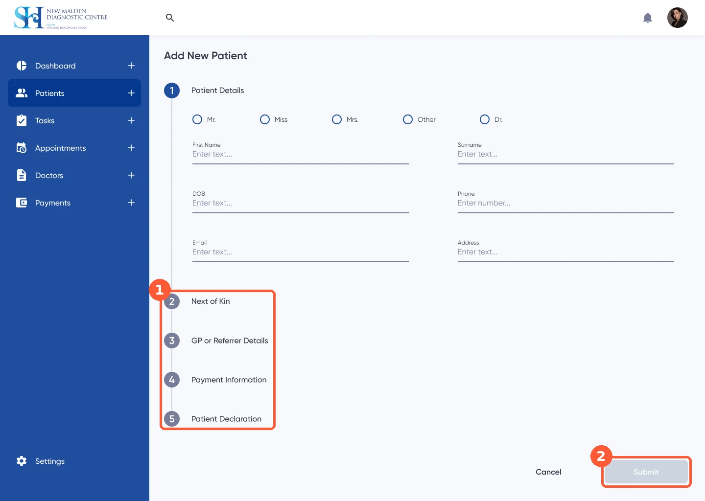
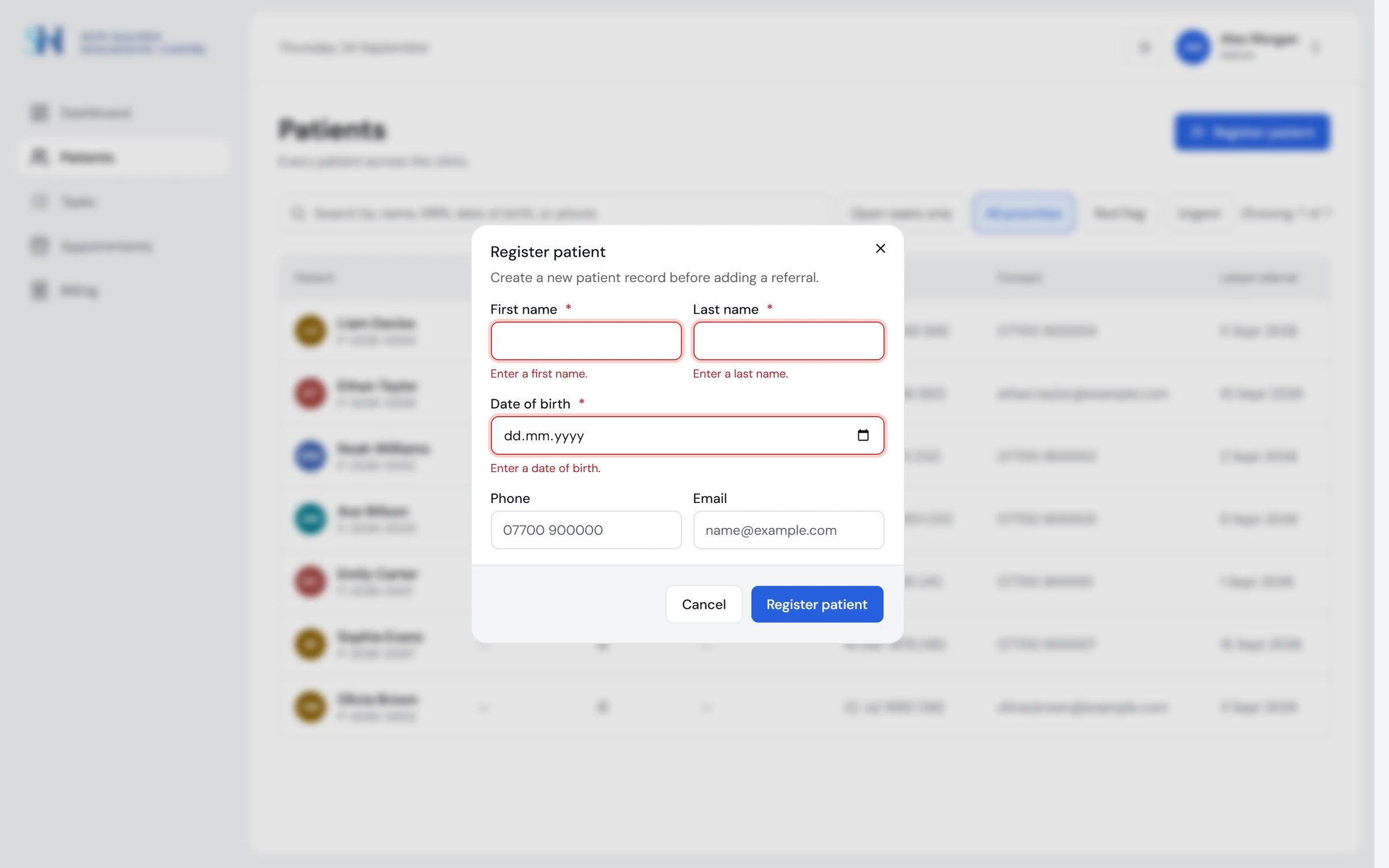
Finding 02
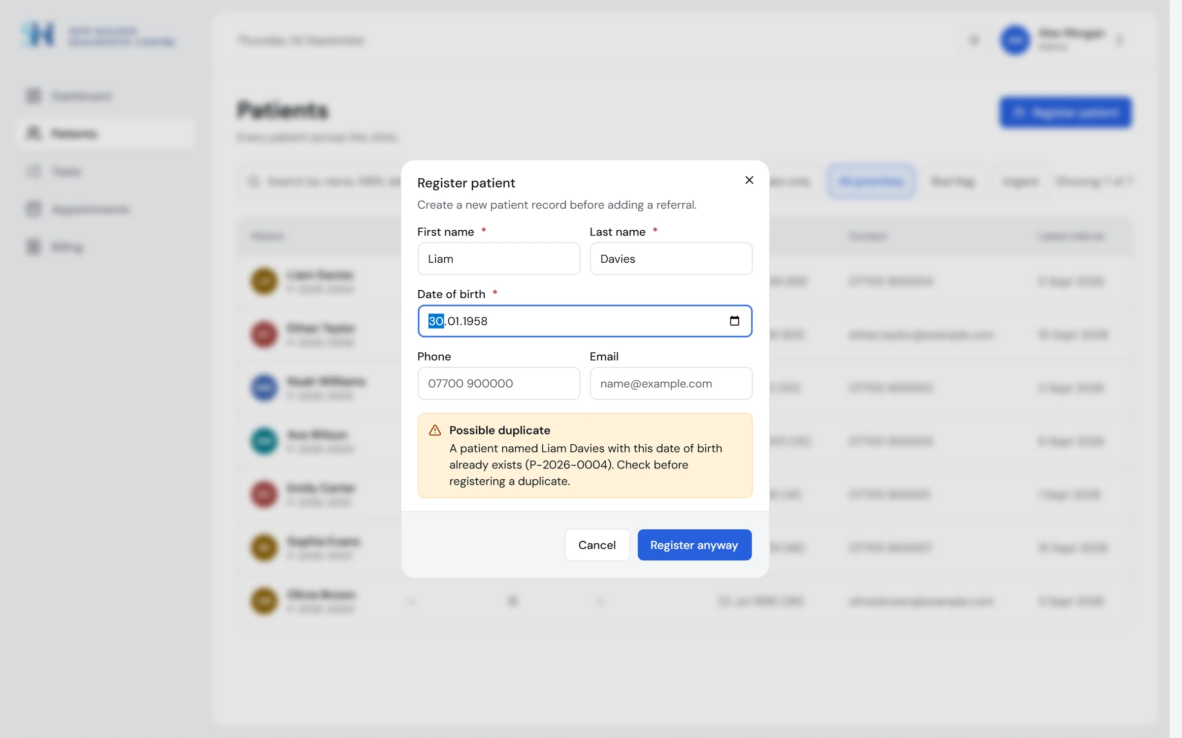
Registration with no duplicate check, and a disabled submit that explains nothing
A form that warns of a possible duplicate and lets the clinic register anyway, with a message under each field that is wrong and a submit that always works.
Version 1 · 2020
Redesign · 2026
Redesign · 2026
Finding 03
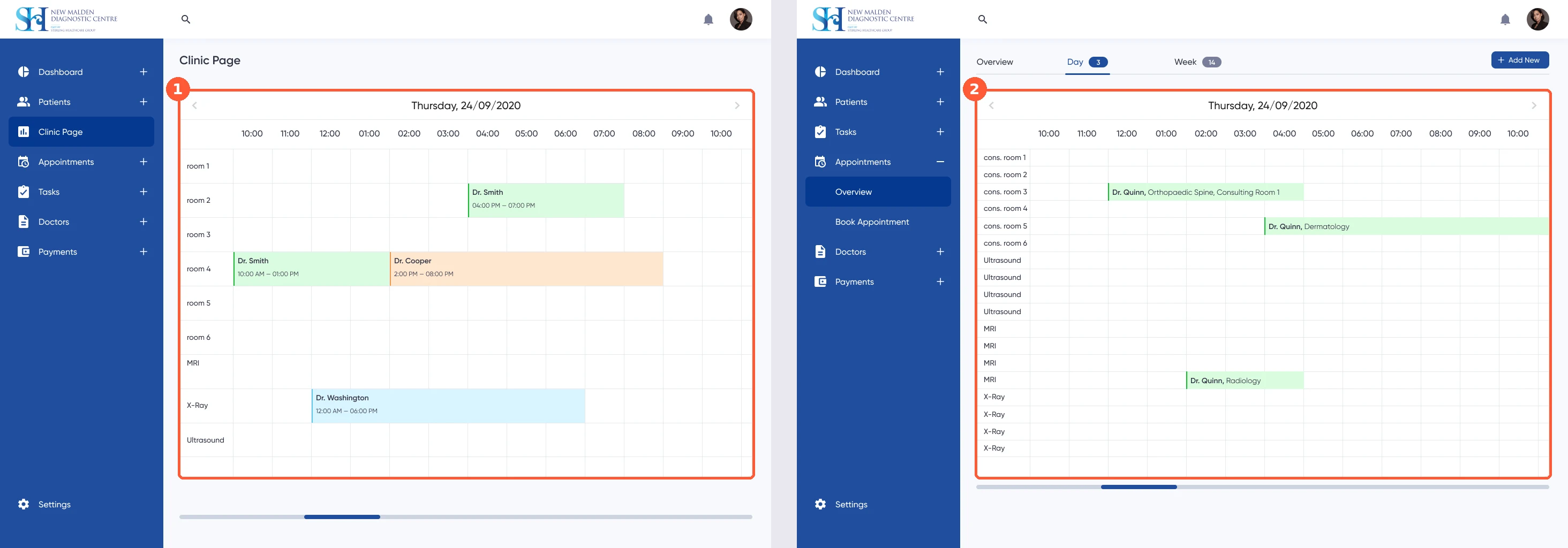
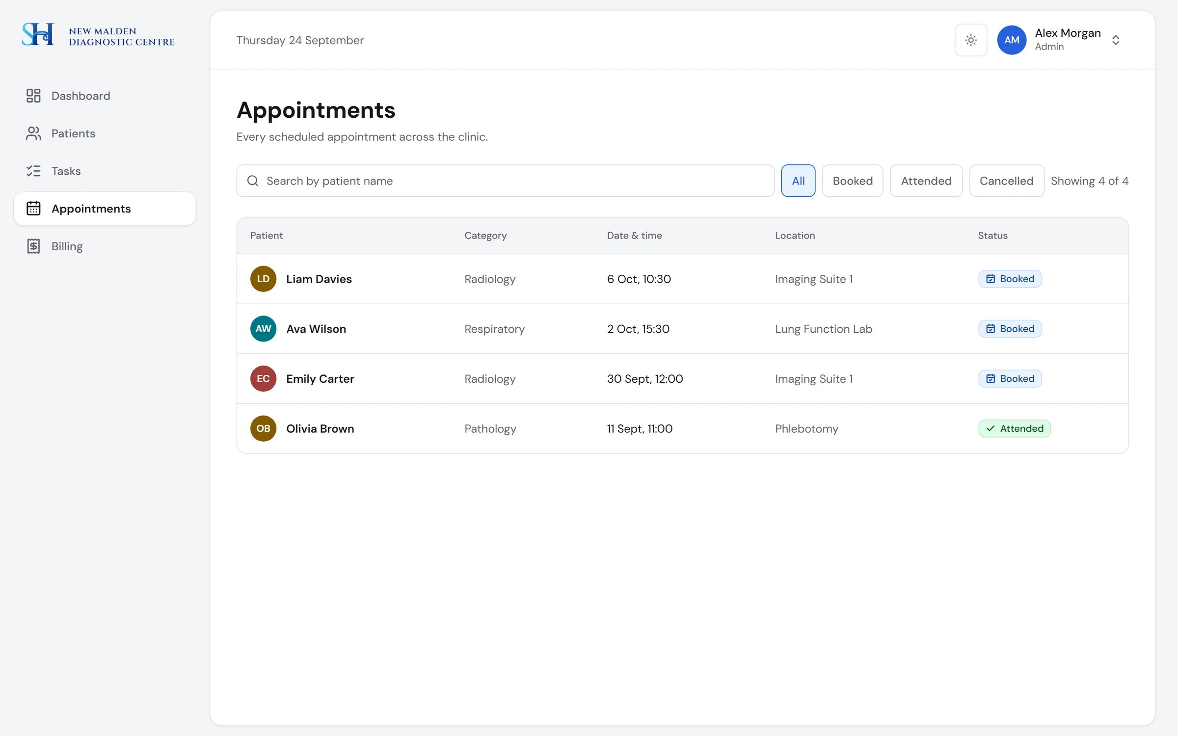
Two overlapping calendars and no clear way to book
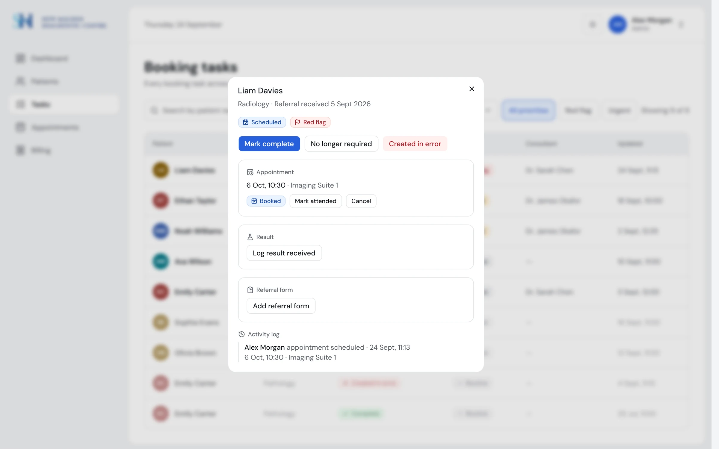
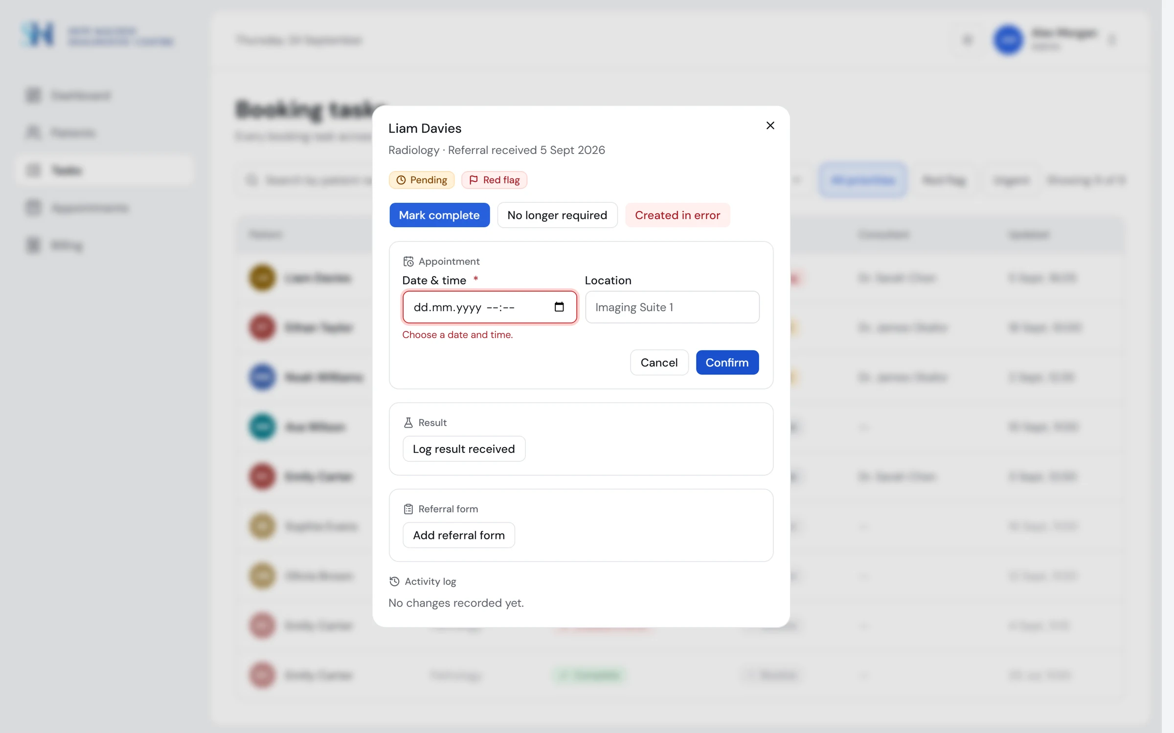
Scheduling lives in the task, with date, time and location, and the task moves to Scheduled on its own. An appointments page lists everything booked.
Version 1 · 2020
Redesign · 2026
Redesign · 2026
Finding 04
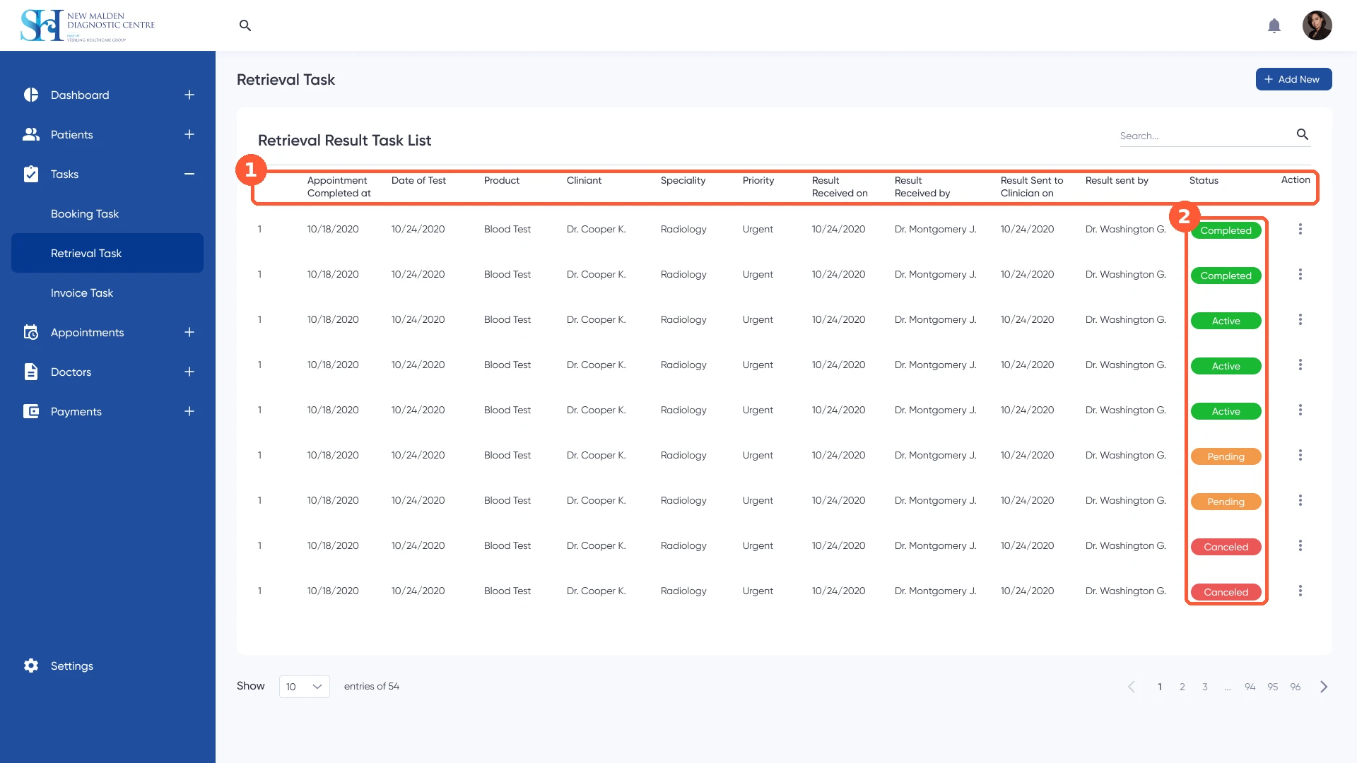
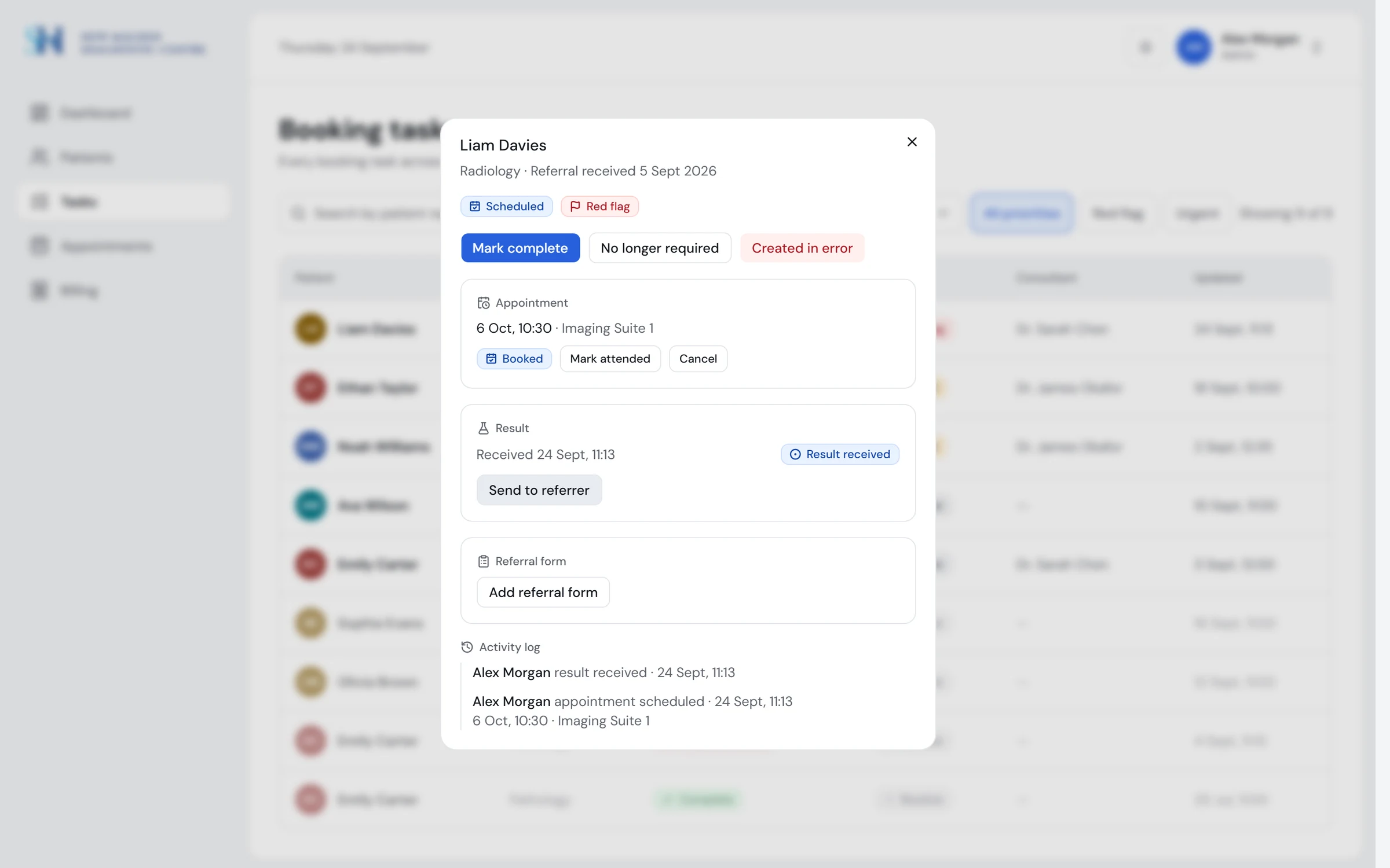
Admin results list with twelve columns and no patient name
Results sit in the task next to the appointment and the referral form, always under the patient's name, with one clear next step.
Version 1 · 2020
Redesign · 2026
Finding 05
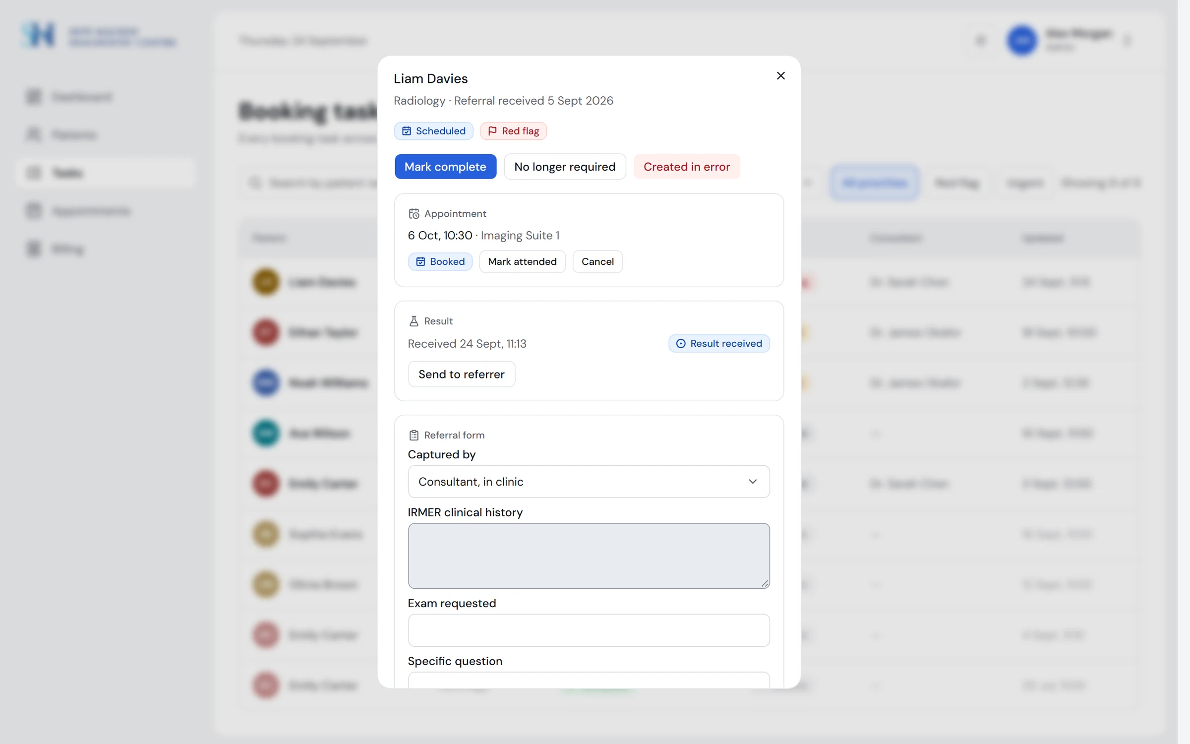
Referral form never designed; intake still on paper
A referral form per category, added from the task and linked to it, with structured fields instead of scanned free text.
Version 1: this screen was never designed; intake was on paper.
Redesign · 2026
Design decisions
Status is colour, icon and label
Readable for colour-blind users and in greyscale.
One primary action per screen or dialog
Staff are triaging, not browsing.
Hover only on clickable things
Hover always means “you can click this”.
Submit is never disabled to hide a reason
A greyed button explains nothing; show what to fix.
Controls a role cannot use are omitted
Nobody meets an error after clicking.
Key flows
Built in code, so you can click through it, not just look at it.
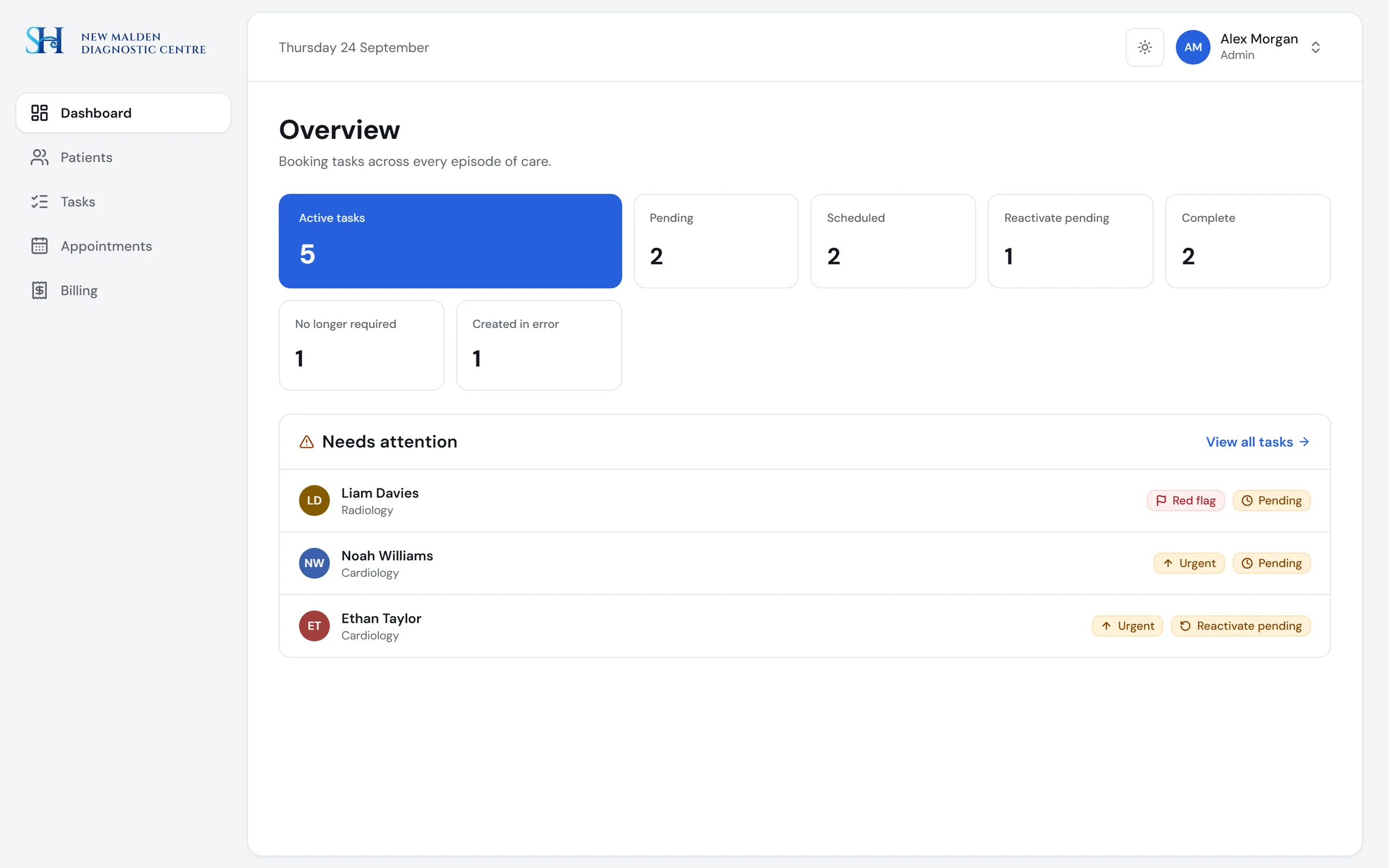
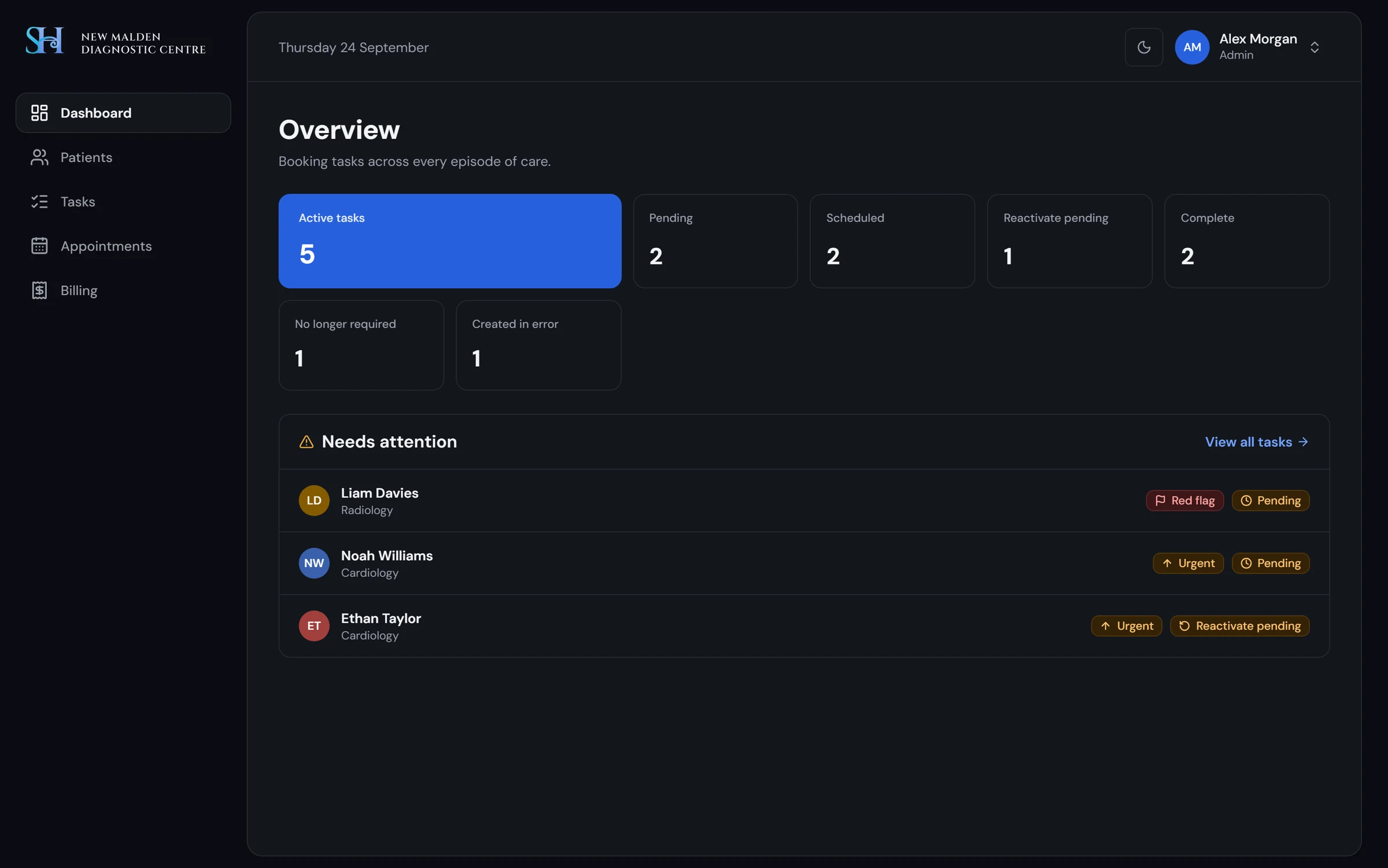
Dashboard: what needs attention
The primary tile counts active tasks. A list underneath puts red flag and urgent tasks first.
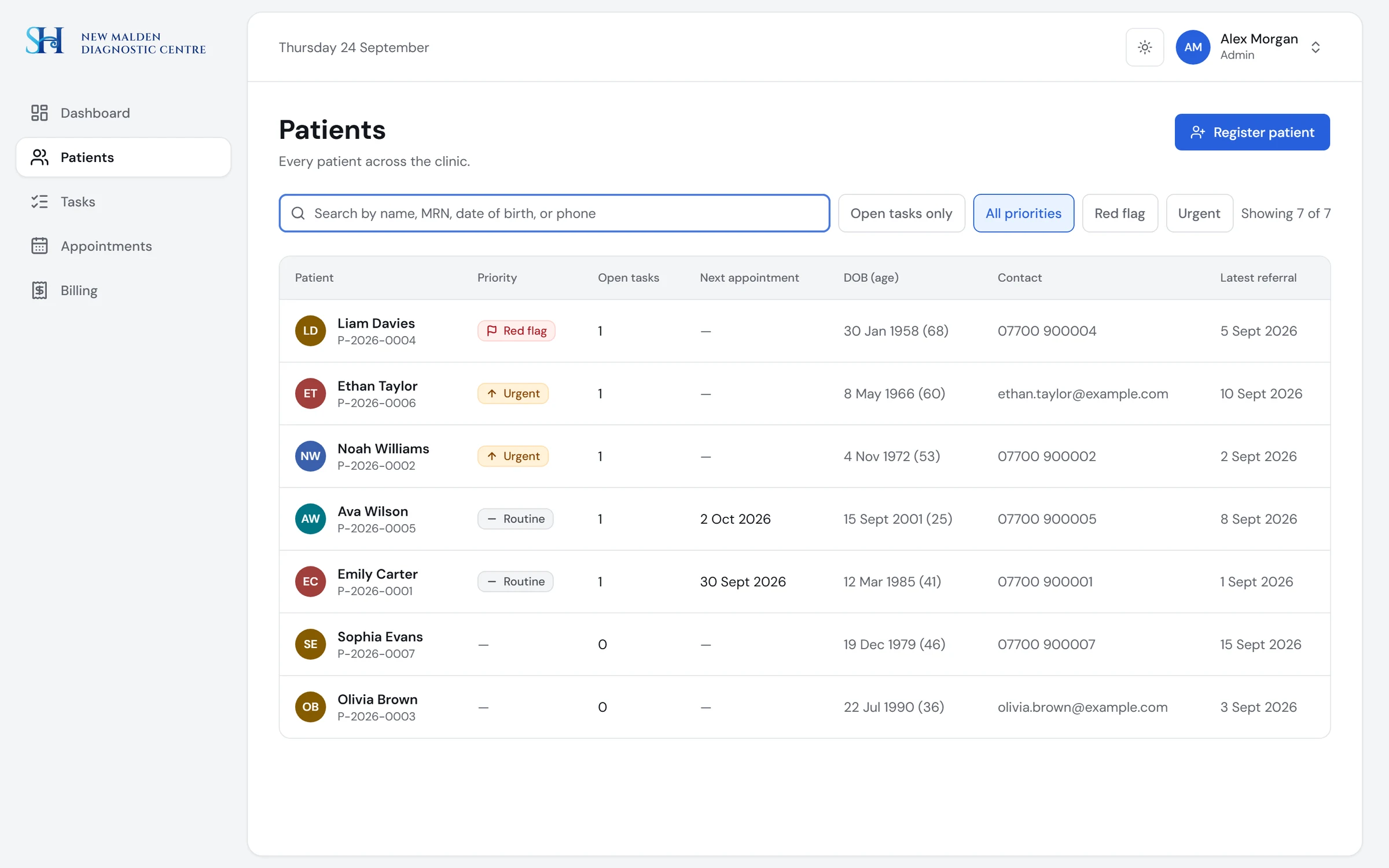
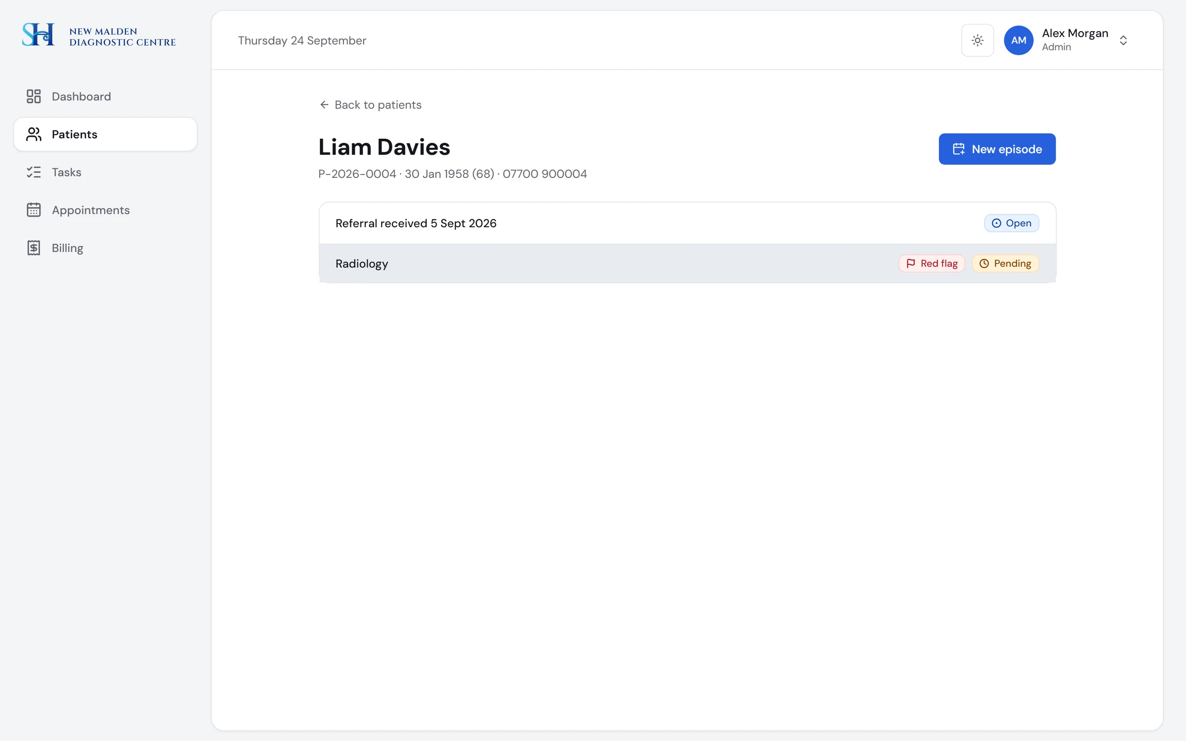
Patients and episodes
Search patients, open a record, and see every referral as an episode with its tasks and billing.
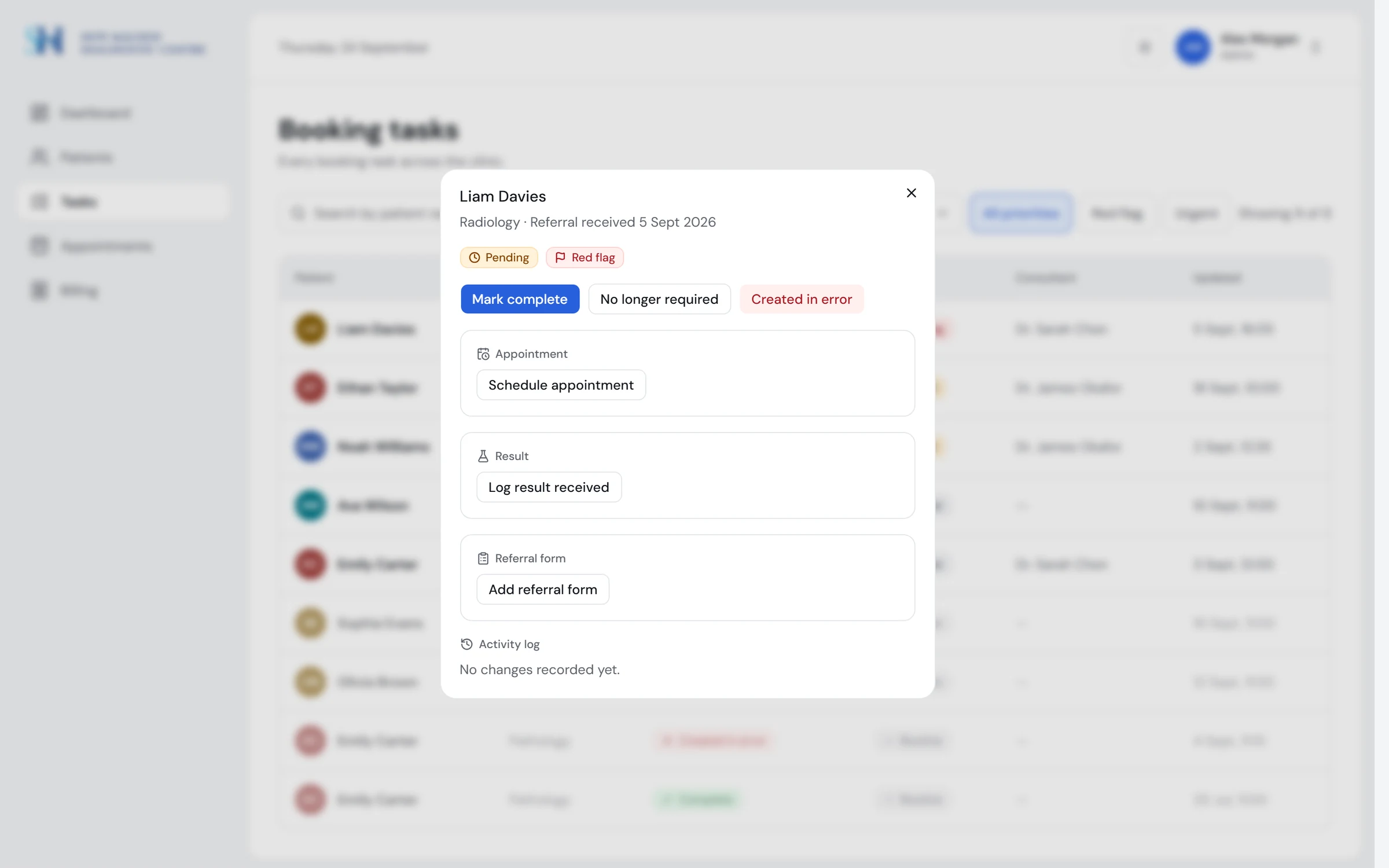
Task lifecycle
Staff move a task only along allowed transitions. Each move is logged with who and when.
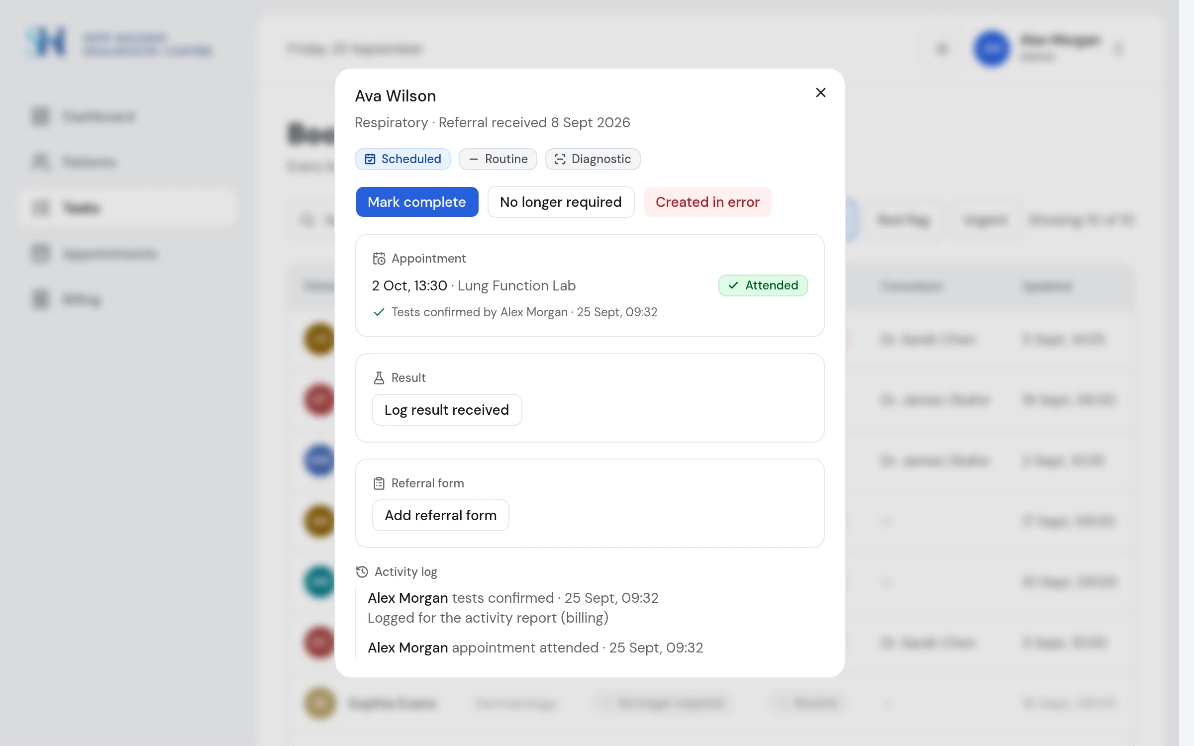
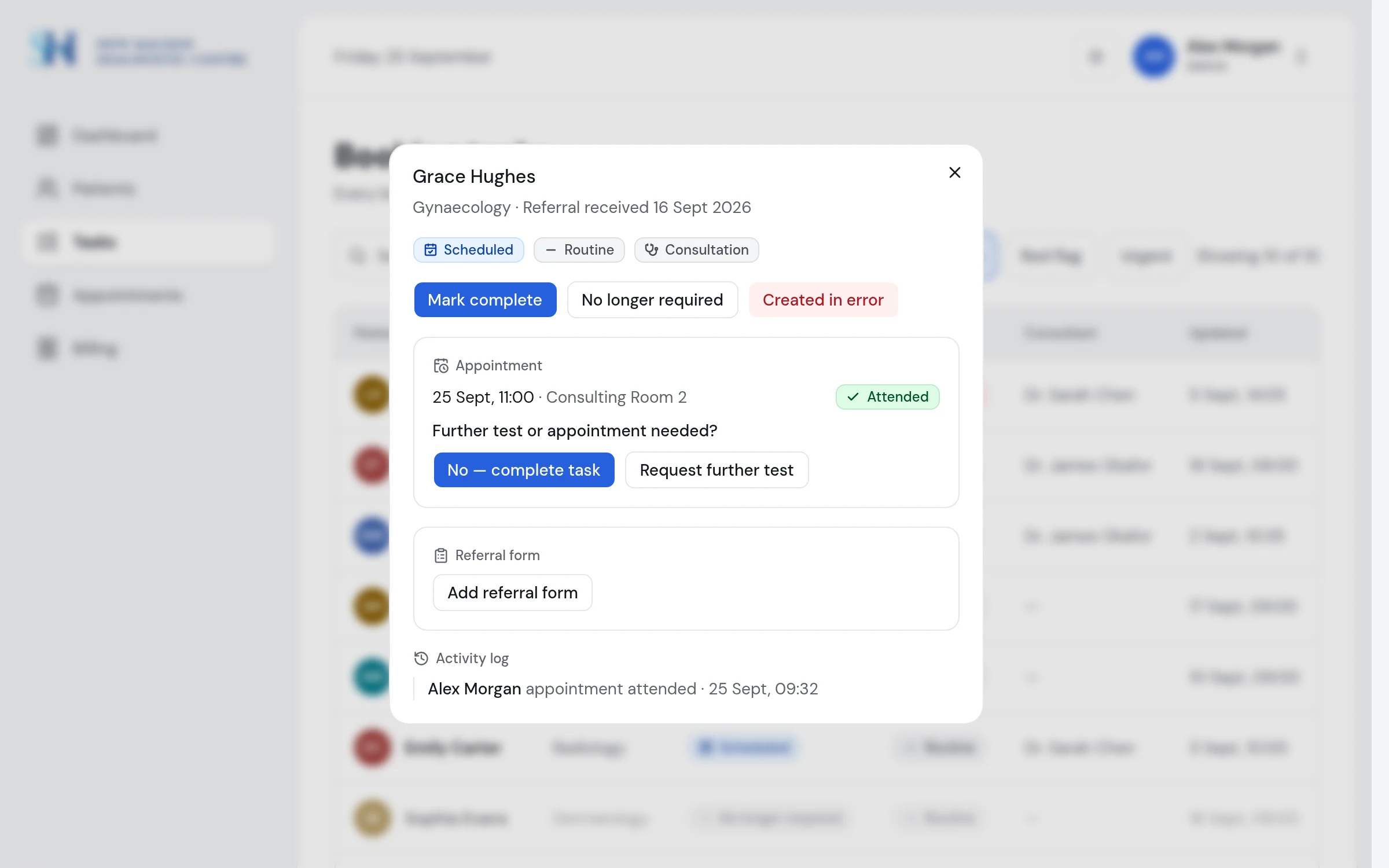
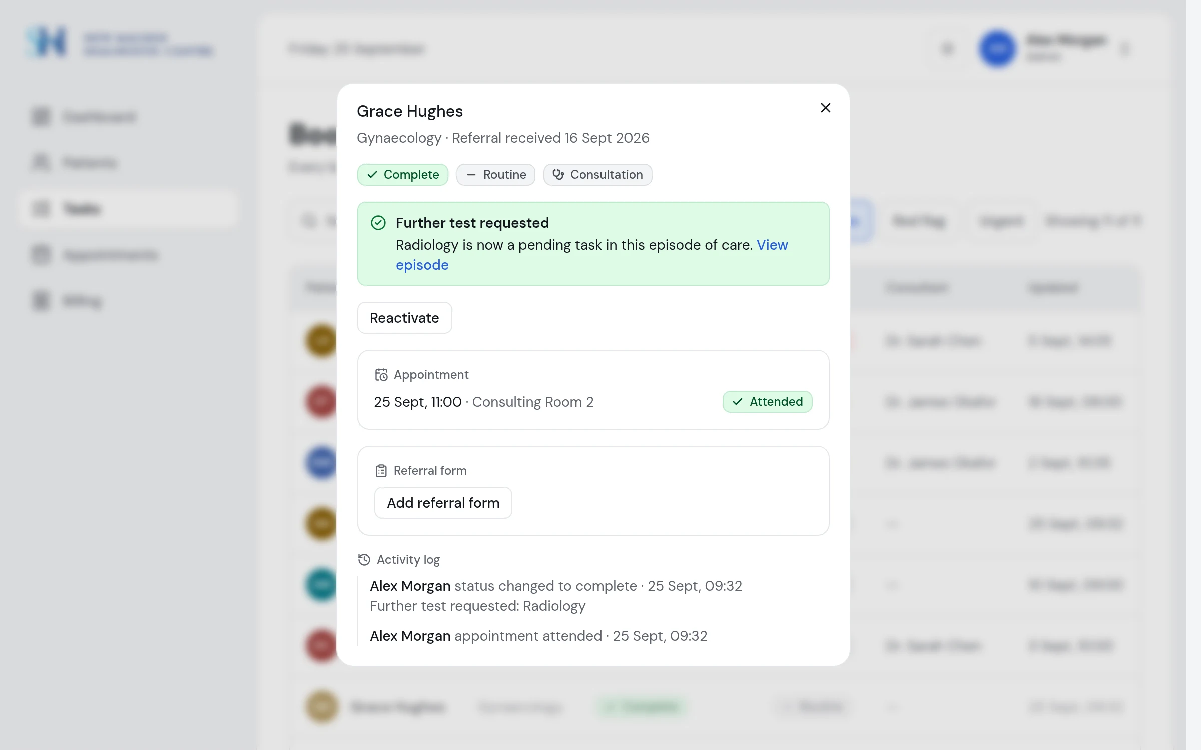
Diagnostic or consultation
Every task carries its appointment type. After a test, the clinician confirms it was carried out, and that confirmation is what billing waits for. After a consultation, the consultant answers one question: is another test needed? Yes creates a new task in the same episode, in one step.
Three roles, three views
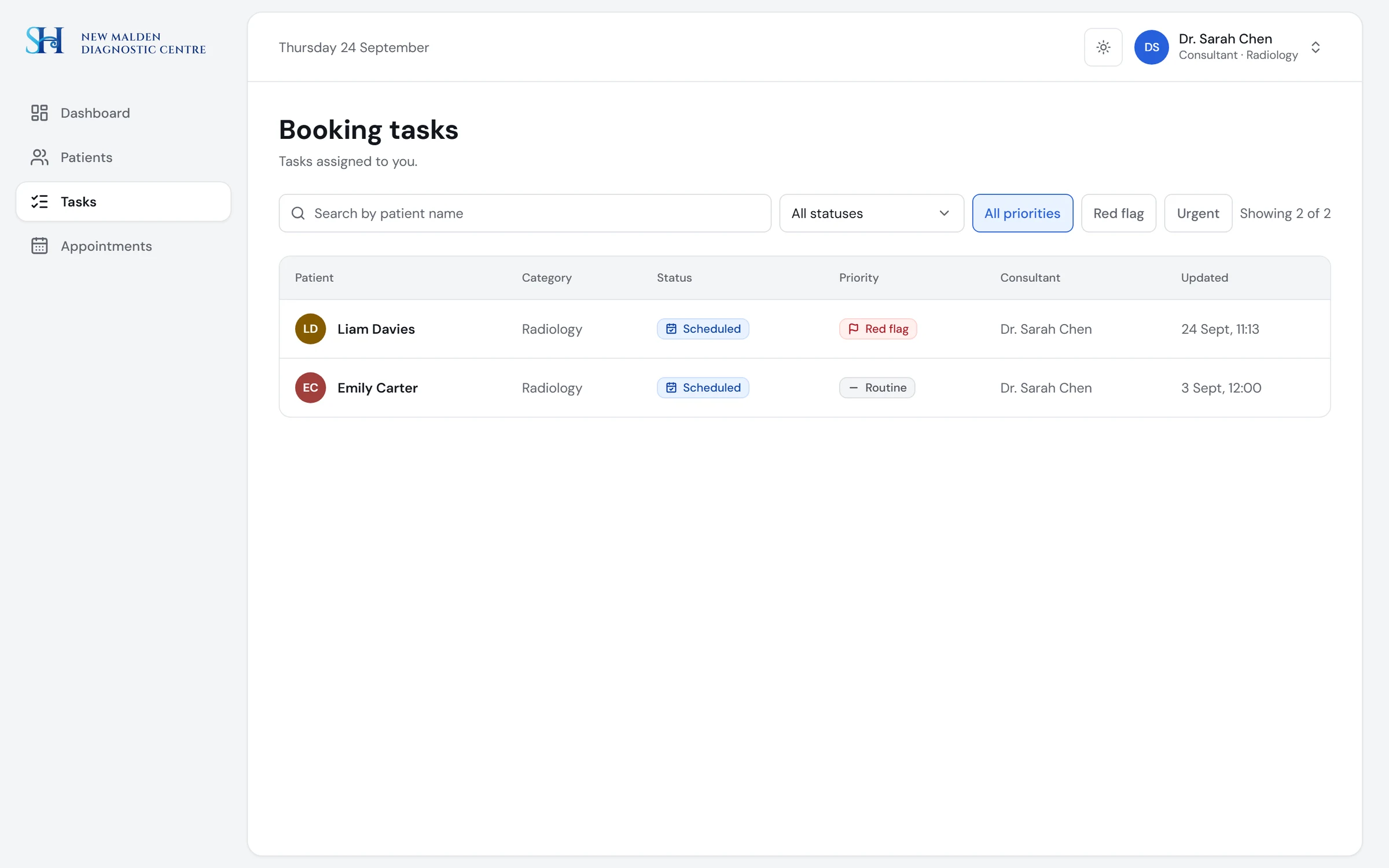
A role switcher steps into each role. A consultant sees only their own tasks and no billing.
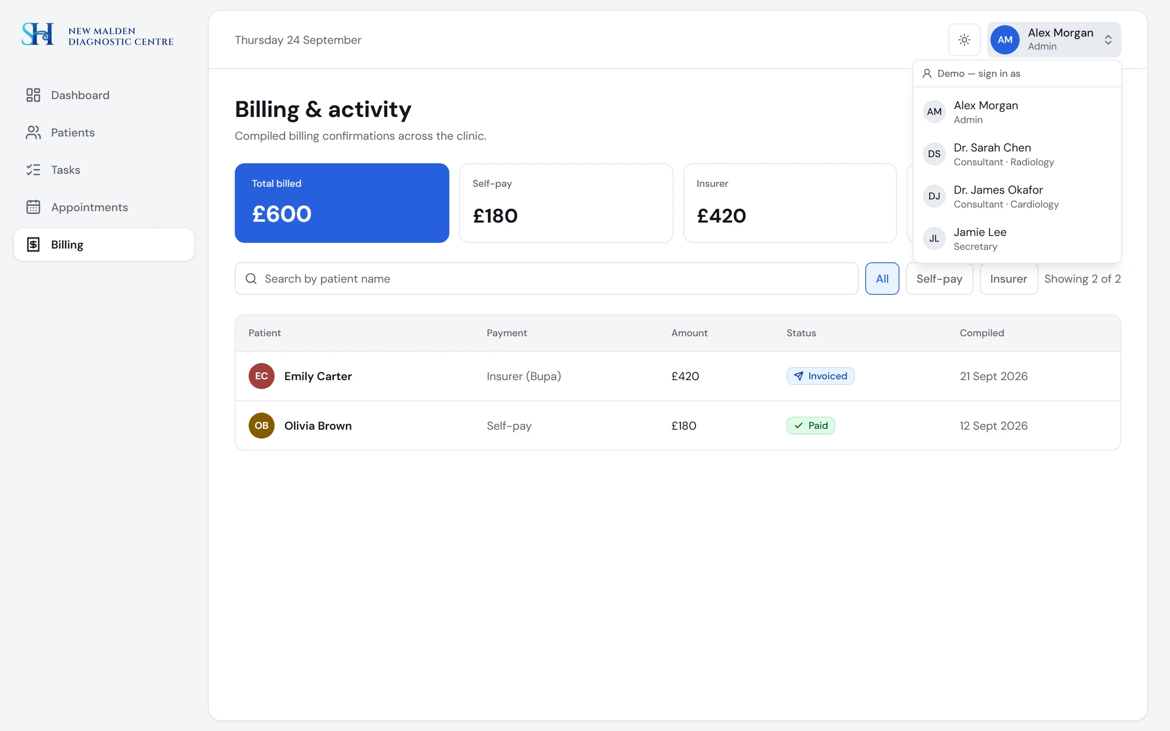
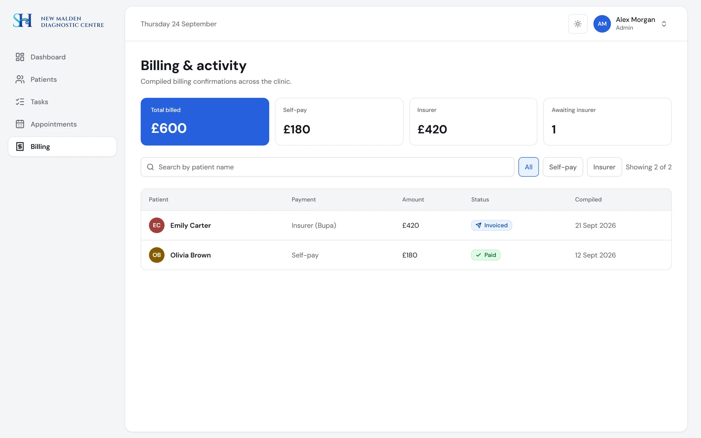
Billing, Admin only
Self-pay is marked paid, an insurer is marked invoiced, and the report totals both.
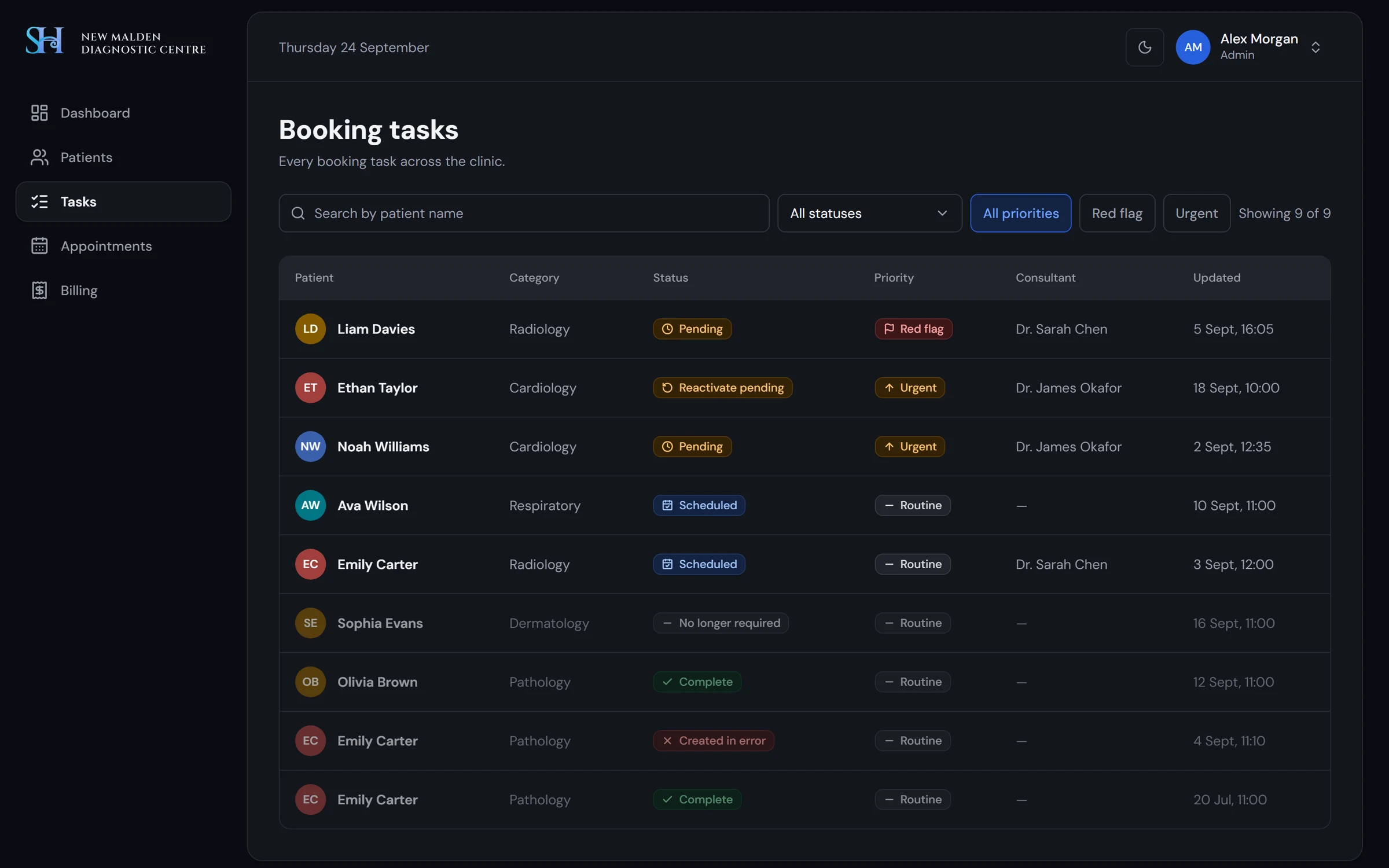
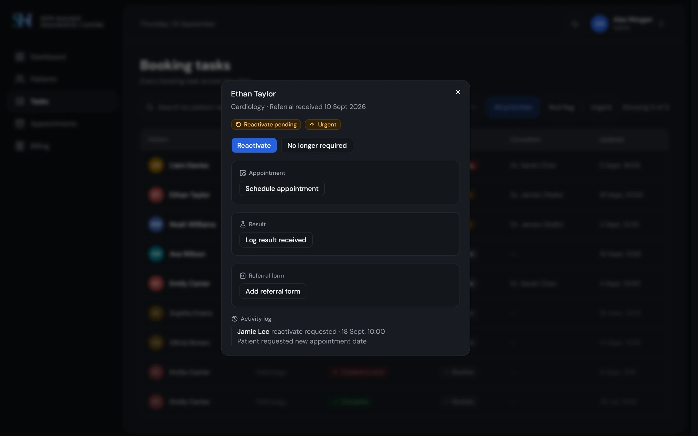
Dark theme
Designed with the light theme from the same tokens, and checked for contrast.
Design system
I made the next screen cheaper to build.
Three tiers of tokens: raw palette, purpose-named semantic tokens, component tokens. Every semantic token has a light and a dark value, and a check fails on any raw colour.
- •Every component documented with live examples, all variants and states
- •When to use it, and do and don't, with real examples
- •Tokens used and accessibility notes
- •A matrix showing every interactive component in every state
Outcome
What exists today.
6
screens and 4 dialogs, covering the pathway from referral to billing
3
roles with different views and permissions
6
task states with an explicit set of allowed moves
60+
Storybook stories, with documentation for every component
3
token tiers, about 100 colour tokens, light and dark themes
AA
text contrast on every screen and dialog in both themes; field borders are still below 3:1
Key takeaways
Three things this project taught me.
- 01
Care is a loop, not a line
A consultation often ends in another test. The system has to create the next task in the same episode, in one step, instead of starting over.
- 02
Billing follows proof
The clinic charges for tests carried out, not tests booked. One clinician confirmation became the link between the clinic floor and finance.
- 03
Audit your own work first
Six years on, our first version's problems were obvious. Auditing my own screens was harder than critiquing someone else's, and it decided what to redesign first.
Try it yourself
Switch between roles in the demo, or read the design system.